Starting this week, Prime Video India is rolling out a new, redesigned experience within the Prime Video app on connected living room devices, including Fire TV, as well as on the Android app. This new experience will be available on these devices to all Prime Video customers worldwide this year, with iOS and Web to follow. We are redesigning the Prime Video experience to highlight our broad selection of content and to make it easier for customers to find the content they love.
Let’s check out the new updates:
1. A more user-friendly navigation menu
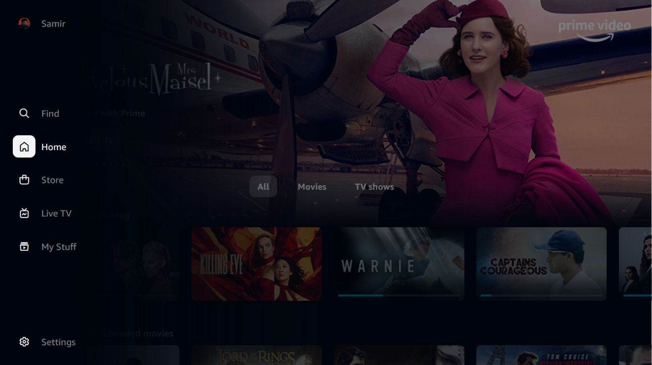
We are introducing a redesigned, simplified main navigation menu that is easily accessible. This helps customers browse our broad selection—including movies, TV shows, and premium channels—and find what they’re looking for quickly and easily. Customers have an easy path to the titles included with Prime membership, such as The Family Man, Mirzapur, The Terminal List, The Boys, and the upcoming highly anticipated The Lord of the Rings: The Rings of Power. For our living room apps, the new navigation menu has been relocated to the side of the screen for improved access. The app will launch with five primary pages: Home, Store, Find, Live TV, and My Stuff. Customers will also have sub-navigation options to more easily browse by content or offer type, such as “Movies” or “TV shows” on Home, and “Channels” or “Rent” on Store. *
2. Explore an expanded content selection through ‘Store’
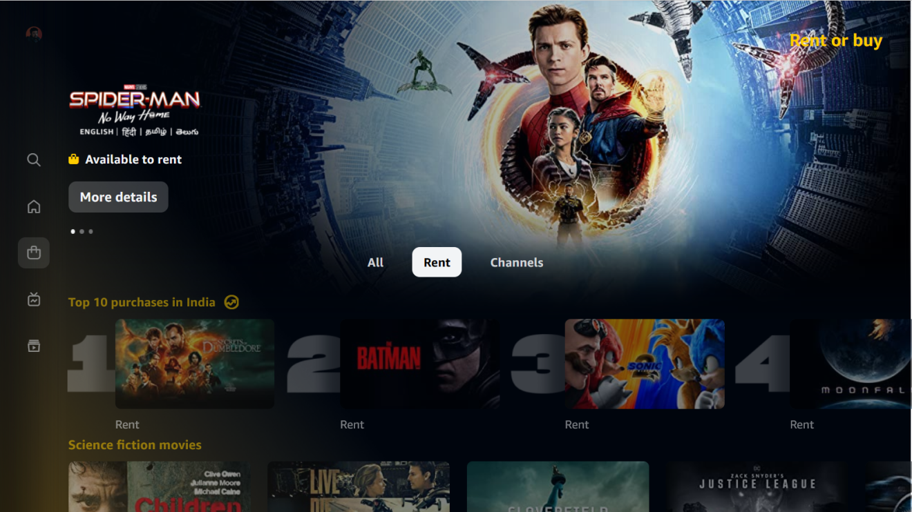
Accessible through “Store” in the navigation menu, our new design contains a single destination from which customers can explore a rich catalogue of movies to rent, along with a wide selection of Channels available as add-on subscriptions. Within ‘Store’, customers are presented with intuitive sub-navigation options: “All”, “Rent”, and “Channels”. On the “Rent” page, customers can find a broad selection of additional movies beyond those available with their Prime membership. These include a curated selection of the latest Indian and international blockbusters available for early rental access, as well as popular movies from around the world. The “Channels” page offers Prime members the option to add on additional subscriptions for multiple video streaming services, providing convenient access to a broad range of additional premium titles directly within the Prime Video app.
3. A faster way to find the videos you want
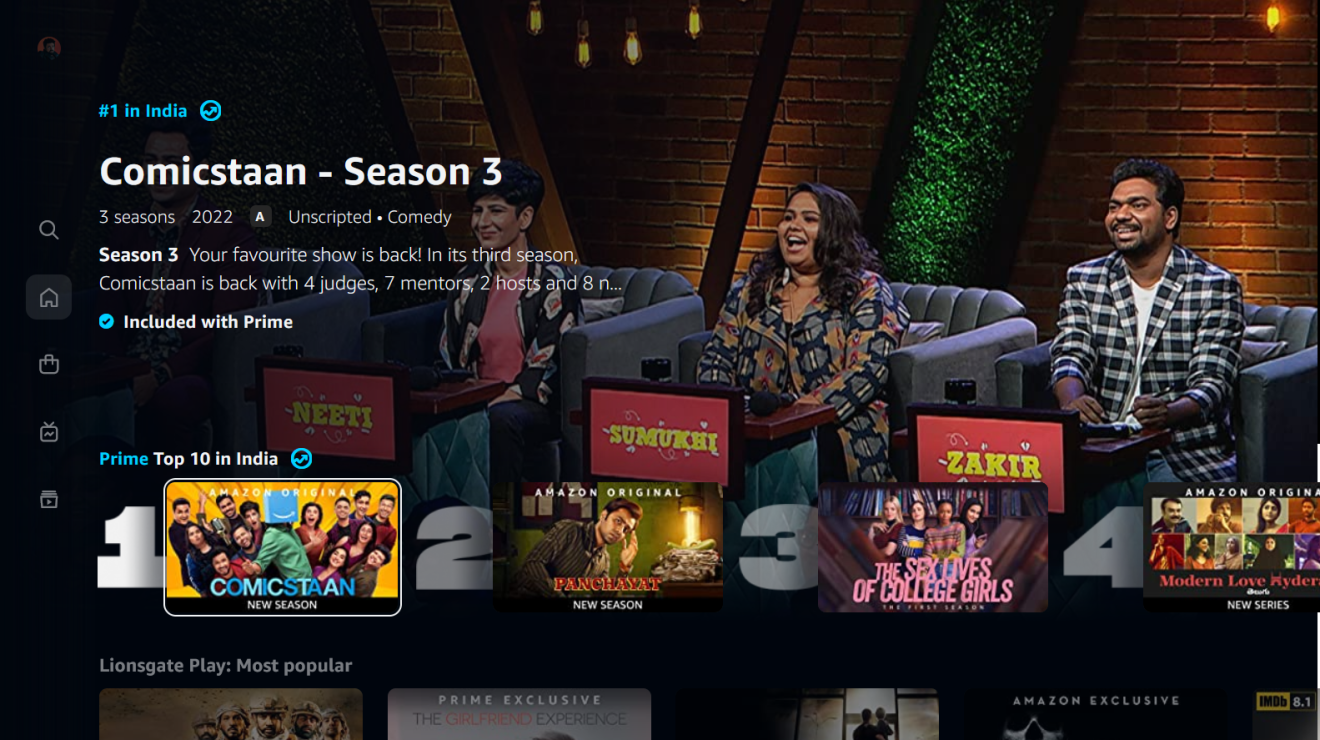
The new Prime Video app comes with new carousels that not only present videos with richer and more cinematic imagery, but also enable customers to quickly and efficiently find something to stream. For example, our “Super Carousel,” with its larger, poster-style artwork, allows featured Amazon Original TV series and movies to stand out against all other titles. Our “Top 10 Charts”, available on ‘Home’ and within the “Store”, tap into the cultural and social zeitgeist, showcasing popular and trending content on Prime Video in a highly visual and easily navigable manner. Dynamic in nature, these charts offer customers an opportunity to know what others in the country are watching and to tune into content that’s popular and happening!
4. Clearly marked content
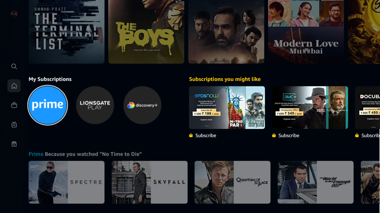
New design features make it easier for customers to tell what content is included with their Prime membership vs. what is available for purchase, either to rent or via an add-on subscription. We employ new visual cues to clearly indicate which videos are included for customers (marked with a blue checkmark icon) and which are available to rent or subscribe (marked with a gold shopping bag icon). And, near the top of Home within the “My Subscriptions” row, customers can access all videos included with their Prime membership, as well as any Channels they may have subscribed to, with only a single click.
5. Immersive visuals
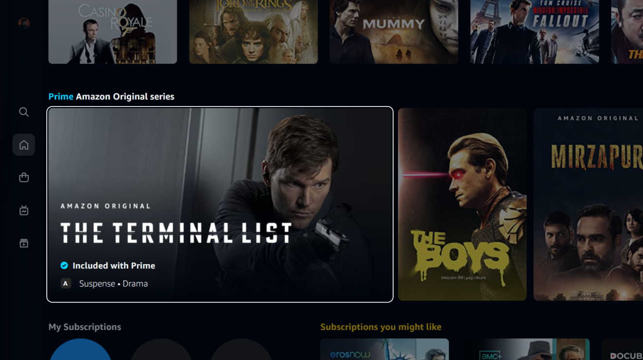
The new Prime Video experience presents content with rich, immersive imagery, thoughtful details, and a new color palette. Our new carousels also showcase titles in a way that makes the experience less busy and more immersive for our customers.
6. A new hub for streaming stations

On the new “Live TV” page, customers are presented with a user-friendly program guide, from which they can easily view everything that is currently on-air from add-on Channels, as well as find out when future programming will begin. Customers can immediately view any live station to which they are subscribed, or simply click-thru to start a subscription for a new Channel.
7. A place to find your favourites – or something entirely new

The redesigned “Find” page simplifies the search experience, giving customers the option to search for a specific title or explore different genres and collections. Search suggestions are shown live as they type, and results are easily filtered by genre, language, or video quality. Search results employ the new visual cues to clearly indicate which videos are included for customers (marked with a blue checkmark icon) and which are available to rent or subscribe to (marked with a gold shopping bag icon).
Like before, ‘My Stuff’ allows customers to keep an easy tab on their downloaded videos, watchlists and also manage their Channel subscriptions, along with rented movies.
*Experience may differ by device.


